This article may contain affiliate links. If you buy through them we may earn a commission at no extra cost to you.
The fastest way to choose a paint color is also the least glamorous: buy a few $5–$12 sample pots, paint 2-foot squares on your actual walls, and live with them for two days. Everything else—color theory, mood boards, designer advice—is secondary to what that color does in your specific room under your specific light. Here’s how to work through the decision without second-guessing yourself into paralysis.
Assess Your Room’s Lighting First
Light is what makes the same Benjamin Moore gray look slate-blue in one room and green in another. Get this wrong and no amount of careful chip-matching will save you.
Natural light direction
North-facing rooms receive cool, indirect light all day. Warm colors can read muddy; cool colors can feel flat. South-facing rooms get warm, direct sun that intensifies yellows and oranges—a color that looked soft at the store can feel aggressive by noon. East-facing rooms are bright in the morning and dim by afternoon; west-facing rooms do the opposite, with intense late-day sun that washes out pastels.
Spend one full day watching how light moves through the room. Photograph the same wall at 9 a.m., noon, and 6 p.m. Those three photos will tell you more than any paint chip.
Artificial lighting
A 2700K warm-white LED pulls color warmer; a 4000K cool-white bulb pushes it toward blue-gray. If you’re replacing fixtures before painting, do that first. If you’re keeping existing bulbs, test your paint samples under those exact bulbs at night—not just in daylight.
Understand Undertones
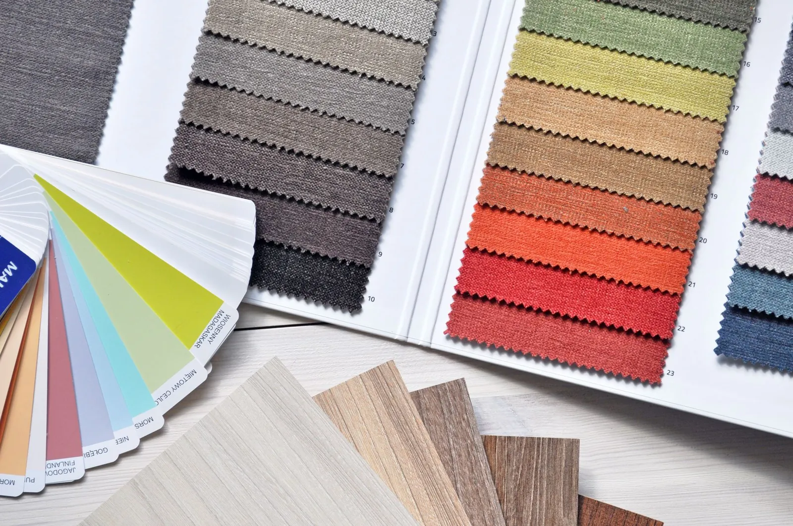
A color labeled “white” might carry blue, pink, yellow, or green undertones. When a color feels subtly wrong but you can’t say why, mismatched undertones are usually the culprit.
Warm undertones
Yellows, oranges, reds, and warm browns make rooms feel intimate. They complement warm wood floors, brass fixtures, and traditional or farmhouse furnishings. Warm whites like Sherwin-Williams Alabaster (SW 7008) suit these spaces better than a stark, cool white.
Cool undertones
Blues, greens, purples, and cool grays read as calm and spacious. They pair naturally with chrome, stainless steel, and modern furniture. Benjamin Moore Chantilly Lace (OC-65) is a reliable cool white for contemporary rooms.
How to spot undertones on a chip
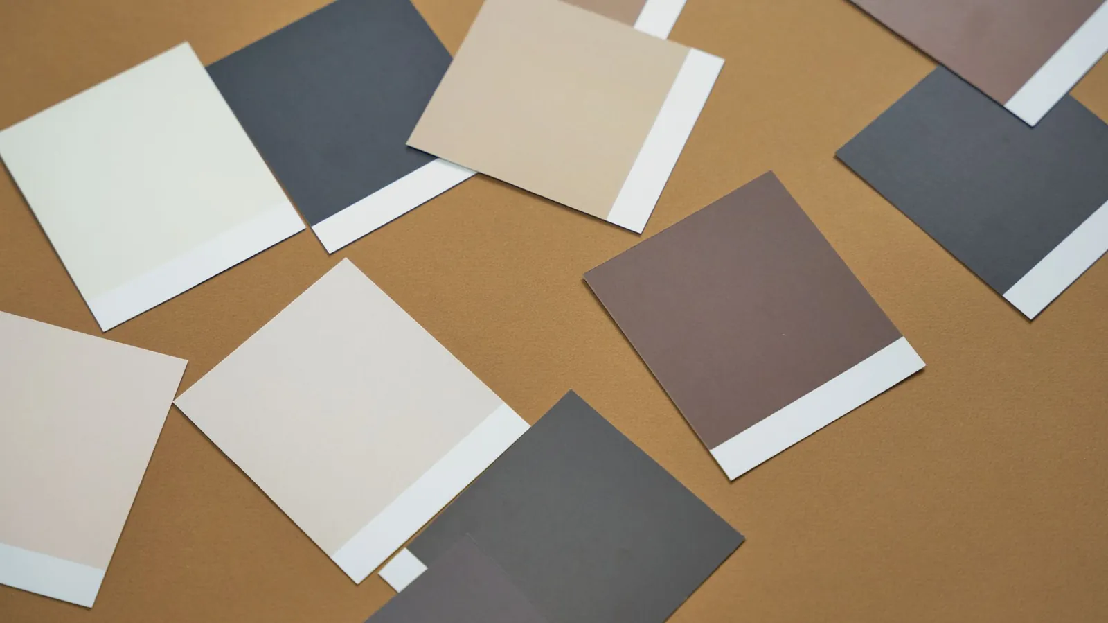
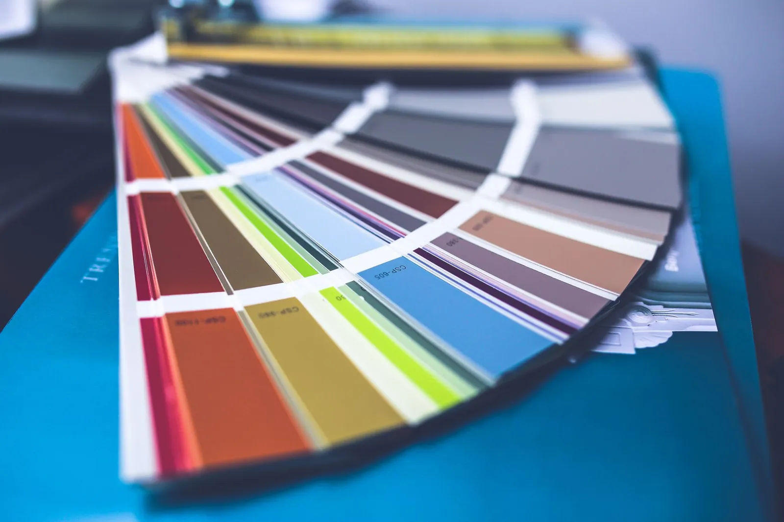
Hold the chip against a sheet of plain white printer paper. If the paint looks warmer or cooler by comparison, you’ve identified its undertone direction. Sherwin-Williams, Benjamin Moore, and Behr all list undertones on their websites if you want to confirm before buying a sample.
Test Samples on the Wall—Not Just the Chip
A 2-inch chip cannot tell you how a color behaves across 12 feet of wall. This step is non-negotiable.
Buy sample sizes
Most retailers sell pint or quart samples for $5–$12 each. Buy 2–4 colors you’re seriously considering. That $20–$48 investment is cheap insurance against a $60–$80 gallon you’ll want to repaint in six months.
Paint large swatches
Use painter’s tape to mark out a 2-foot-by-2-foot section on the wall you’ll actually be painting—not a piece of poster board you move around. Apply two coats to approximate the finished look. Leave the samples up for at least 48 hours and check them in morning light, afternoon light, and with the lights on at night.
Give it time
I’ve reversed my opinion on a color by day three. Your eye adjusts, and what felt fresh on day one can feel relentless by day four. If you’re still comfortable with it after two or three days, commit.
Match Color to How the Room Is Used
Color affects how a room feels to be in, which matters more in spaces where you spend long, quiet hours than in rooms you pass through quickly.
Bedrooms
Soft, low-saturation colors support sleep and calm. Pale blues, warm grays, and muted sage greens are reliable choices. Saturated or high-contrast colors—even ones you love—can make it harder to wind down.
Kitchens and dining areas
These rooms tolerate slightly bolder color because you’re rarely stationary in them for hours. Warm whites, soft yellows, and gentle greens work well. Before deciding, hold your samples next to cabinet colors and countertop material in natural light—the interaction matters more than the color in isolation.
Living rooms
You have the most flexibility here. Deeper, richer tones work in larger rooms with good natural light; the same shade in a smaller, darker room can feel oppressive. Test before you commit.
Small rooms and hallways
Light, neutral colors make tight spaces read larger. If you want color in a small room, choose a muted version of the hue rather than a saturated one. See our guide on best neutral paint colors for tested options that work in tight spaces.
The best paint color is one you’ve tested on your actual wall in your actual light—never trust a paint chip alone.
Work Around What You’re Keeping
Paint is one of the cheaper elements in a room, but it’s time-consuming to change. Design around the things that are expensive or fixed: flooring, cabinetry, countertops, large upholstered furniture.
Pull chips and hold them directly against your flooring and cabinet fronts in natural light. Warm wood cabinets often clash with cool grays; cool-toned gray sofas can make a warm beige wall feel disconnected. You don’t need exact matches—deliberate contrast works—but mismatched undertones that happened by accident rarely do.
Choose the Right Sheen
Sheen affects both appearance and durability. The practical breakdown:
- Matte/flat: Hides surface imperfections well; harder to wipe clean. Best for low-traffic bedrooms and formal spaces.
- Eggshell: Slight sheen, more washable than matte. A good default for living rooms and adult bedrooms.
- Satin: Noticeably shinier, easy to wipe down. The practical choice for kitchens, bathrooms, kids’ rooms, and hallways.
- Semi-gloss/gloss: Rarely used on walls; standard for trim and doors where durability matters most.
I default to eggshell in most rooms because it cleans without looking plasticky. Satin is worth the extra sheen in any room that sees cooking splatter or small children.
Plan Colors Across Multiple Rooms
If you’re painting several rooms, the colors don’t need to match—but they should feel like they belong to the same house. Three approaches that work:
- One neutral throughout common areas; more personal colors in bedrooms and bathrooms.
- The same neutral everywhere; color comes from furniture and art rather than walls.
- Related hues in adjacent rooms—different shades of blue-green, for example—so transitions feel intentional.
Once you have samples up, walk your home’s natural path from entry to living room to hallway and see how the colors read in sequence. A jarring transition between rooms is easy to spot before you’ve bought a single gallon.
Frequently asked questions
How many paint samples should I test?
Start with 2–4 colors you genuinely like. Testing more than four at once becomes confusing and usually means you haven’t narrowed your direction enough yet. If none of the first batch feel right, step back and identify what’s missing—too warm, too dark, too saturated—then try a focused second round.
Can I paint over a color I don’t like?
Yes. Dark or saturated colors usually need a coat of primer ($20–$40 per gallon) before the new color will cover evenly. Light colors can sometimes go directly over dark ones with multiple coats, but primer is faster and more reliable if you’re making a significant change.
What if I love a color but it’s too bright?
Ask the paint desk to mix a lighter tint of the same formula. The undertone stays identical; only the intensity drops. This costs the same as the original color and is often the easiest fix when a shade you like feels too saturated for the room.
Should I paint trim and walls the same color?
White or off-white trim against a colored wall is the most common approach because it creates definition and makes architectural details read clearly. Painting trim and walls the same light neutral creates a quieter, more seamless look that suits contemporary spaces. Both work—the choice is stylistic, not technical.
How long do paint samples last on the wall?
Leave them up for at least 48 hours, ideally three days. You can paint directly over dried samples with your final color; if you’re changing sheens, a light sand first helps adhesion. There’s no need to prime over them before painting the full room.

Rob is a former carpenter who now explains home repairs so you only have to do them once.